ony sends this chart and asks if it can be done in Excel. It sounded like a good challenge for a lazy Sunday morning. So here we go. (Posting it on Monday).
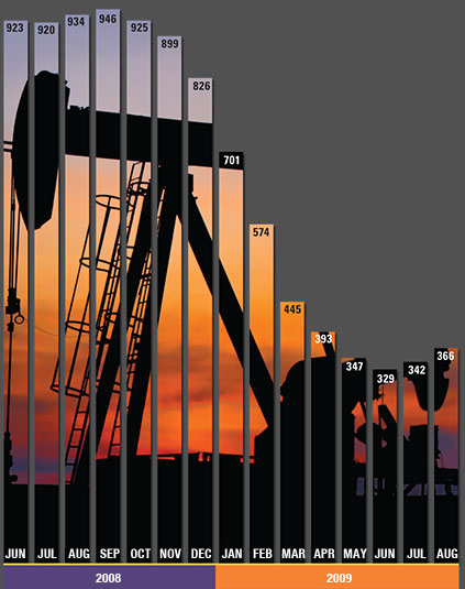
Now I could not get an oil rig photo or that data. So I made up few numbers and used a photo of Flinders street station I took when I was in Melbourne last year.
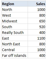
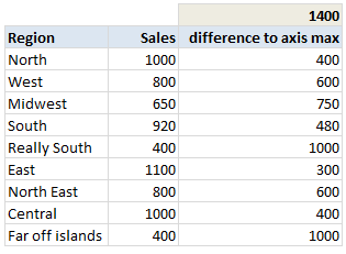
Step 1: Arrange the data.
Arrange the data like this.
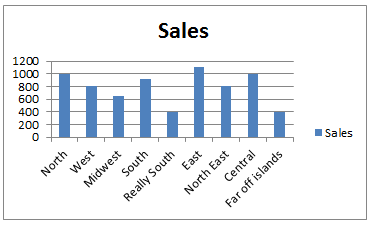
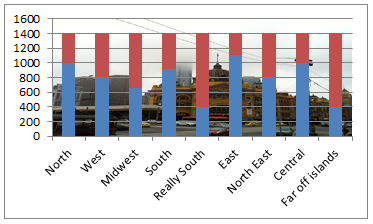
Step 2: Create a column chart
Select the data, insert a stacked column chart (why not a regular column chart?, you will understand in a minute).
You will get this.
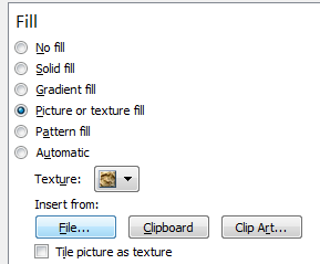
Step 3: Set up image as background for chart's plot area
Select chart's plot area. Press CTRL+1.
Choose picture or texture fill and select the file with image you want.
Step 4: Add dummy max-series
In your data, add a column which gives the difference between column values axis maximum. For our test data, I choose 1,400 as axis maximum, so the dummy series values are,
Now add this series to chart.
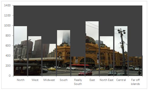
Step 5: Format the chart
Now, we are almost done. Our chart looks like below. We just need to format it.
- Select the columns (any series) and press 1
- Adjust gap width to 0%
- Fill the dummy series with a chosen background color.
- Make the data series transparent (fill color = no color)
- Add borders to data series. Border color should be same as background color.
- Adjust the border thickness to 3pts.
- Adjust axis maximum to 1,400 (or any value you have selected in Step 4).
- Remove grid lines, legend and any un-necessary chart fluff.
Your column chart with background image is ready!
Note of caution: Go easy with images
The main purpose of a chart is to convey information. By adding a background images, sometimes your chart will be difficult to read. So I suggest you to go easy with background images.


No comments:
Post a Comment